UI Shaders
UI Sheen Shader
Options relevant to the orels1/UI/Sheen shader
A metallic-like effect for your UI Elements
Sheen Demo
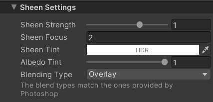 Sheen Inspector
- Sheen Strength: Controls the strength of the sheen effect
- Sheen Focus: When > 1, the sheen effect will be more focused on the center of your view. When < 1, the sheen effect will expand towards the edges of the UI elements
- Sheen Tint: The color to tint the sheen by. If Albedo Tint is 1 - has no effect
- Blending Type: Controls the way the sheen is blended on top of the base color. Follows the Photoshop Blending Modes
- Overlay: Darkens and Lightens the base color of the UI element by the sheen effect. Generally produces the best results due to pleasing color mixing
- Lighten: Picks the lightest color between the base color and the sheen effect
- Screen: Stacks the lightness of the base color and the sheen effect
- Multiply: Multiplies the base color and the sheen effect (produces darkest edges)
- Force Discard: Force-discards transparent pixels to avoid potential white pixel artifacts on sprite edges. Especially useful when using no sprite at all.
Shader Channels Required
Make sure your root Canvas component has Normal checked in the Additional Shader Channels dropdown when using this shader
Here are some good settings for full-color images
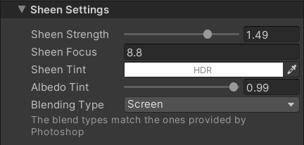 Good settings for full-color images